


INS(oev)IDE #1
The first of a newsletter where I will be highlighting some of my recent photos, the stories behind the interactions, and the things that caught my eye.

One of the most common questions I receive when people are looking at my website/book/IG and asking me about the process is “how do you choose who you’re going to take a photo of?". The second question is often “How?!”.
To address Q1 of “who & why?” I was internally hoping that question would be analyzed and answered in ~25 years as people in the future look at the project as a whole and try to pick up the patterns and clues as to what I choose to capture, and what I choose to leave out every season… for their dissertation, or art gallery, or book chapter, or something... I’ve come to realize that there are so many photos and so many street photography projects out there, mine will likely always stay pretty low-key. So, for now, I will attempt to do that writing for myself.
This will be an opportunity to do some self-reflection and more writing, tell some stories, and offer something new for the people who enjoy analyzing the photos themselves.
It will also allow me to expand on some aspects for Q2 of “how?!”.
I have a few “operating in a street ground rules” I go by, and will be adding them here and there when I am telling stories about some of these interactions as well. More on that to come.
Let’s start this one here…
“Hi, sorry to bother you, I take photos in the neighborhood. Portraits of different people, clothing, culture, and things happening in this area; do you mind if I take a quick photo?”
That right there is how every photo starts.
Sometimes I may fumble a few words if I am nervous or the heart rate is up as I had to catch up to stop the person for a photo, but otherwise, that’s the go to, right there.
If it’s someone I have an established relationship with, I usually skip the first part, but I probably used that line when we first met. I’ll be the first to admit it’s nothing special, but it works. It’s my go to and is pretty much on auto-pilot.
Anyways, onto some analysis.
Batch 1 - Fall 2023
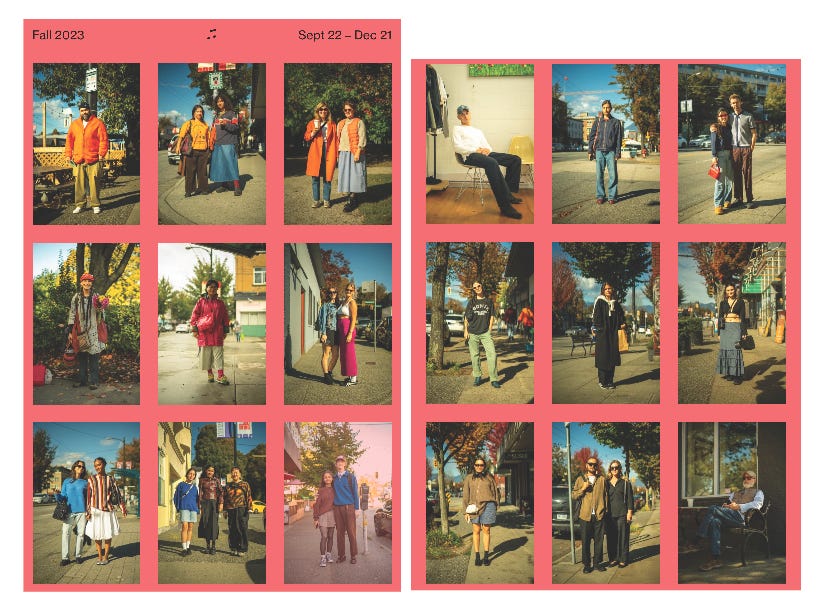
This most recent upload (screen shotted above) happened to work out so beautifully. I don’t intentionally take photos to fill the grid in this manner (themed across), but once in a while, magic like this happens. It may be a bit of a reach but, this upload reminded me of the old Bill Cunningham spreads.
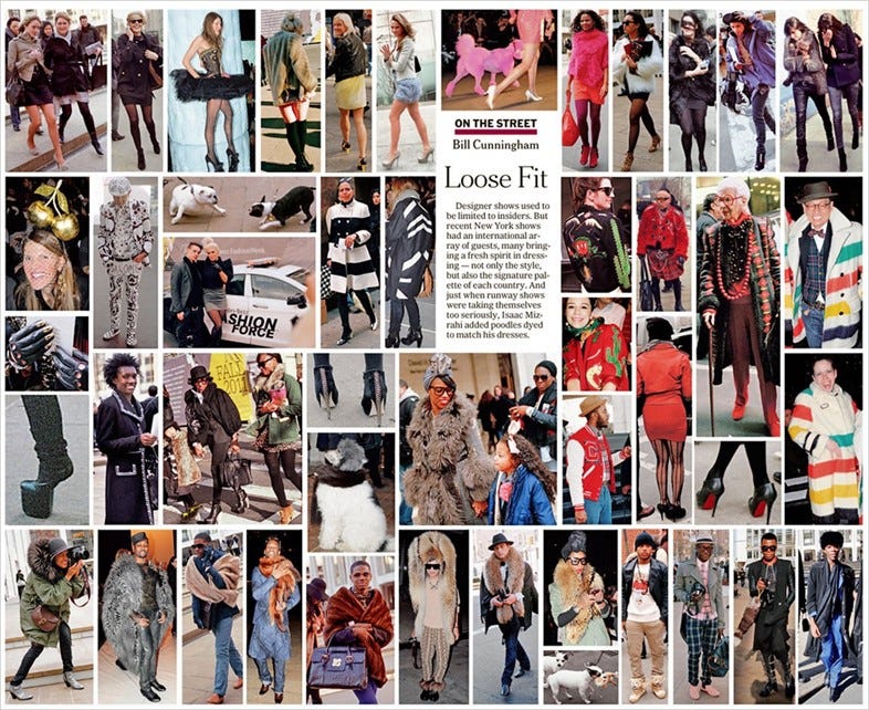
I’d love to be able to publish this type of page once a week, but it doesn’t always work and in comparison; he obviously had much more time (it was his full time job), and way more people to choose from (7.9 million vs. 2.6 million). But once in a while, during the uploading process to the website, they occasionally fall in line perfectly.
I had started to sort this group with orange to highlight Truth & Reconciliation and there it started…three orange, pops of pink, blue sweaters, jean, black, brown, boom. A beautiful coincidence.
The first photo I’d like to start with is this one.
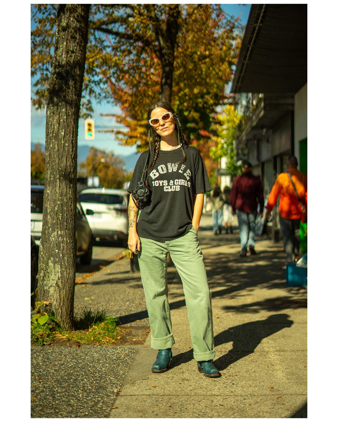
This outfit caught my eye as she was walking across the sidewalk towards her car. The t-shirt stood out immediately, I initially read “Bowen” as she went street-side to look for oncoming traffic and open her car door and it sparked my curiosity. Luckily I caught her attention before she went to get in and she agreed to let me take a photo.
One of my favorite patina affects is the fading and disruption of white ink on a vintage black t-shirt. The way it cracks, fades, and wears away is always so unique and can often show signs of love and consistent use of a t-shirt, which I think makes this type of t-shirt great. The cotton or cotton poly-blend material often has to be well worn and washed a thousand times before a black t drops off the body so fluidly and creates the lettering fade seen on this one. This tee is definitely something I would have picked up myself if I found it on a vintage rack somewhere.
As we quickly chatted and waited for some the foot traffic to pass by, I started catching more details of the outfit. The Open YY bag, the fatigues, braids, and killer boots, this was a great look and I started to really focus on the framing of the photo.
I quickly snapped a few photos and inquired about the t-shirt. Turns out it was “Bowie” boys and girls club, which is located in Bowie, Maryland, which is wild to think about the journey this t-shirt has taken over the years to end up in a photo in “east Vancouver”.
We said our good-byes and on went the day.
When back home editing more details popped in the photo, namely the orange and green trees in the background giving some seasonal context to contrast the mid-day t-shirt wearing. The smirk is perfect and the stance matches the attitude of the outfit. Thanks Mikaela.
Photo #2
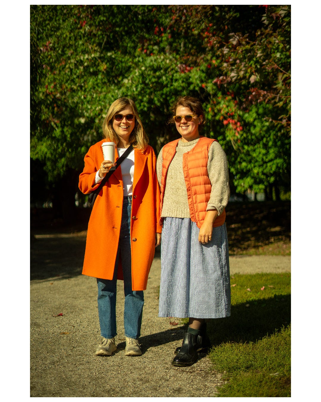
My family and I came to the Trout Lake market early on Saturday morning to grab some snacks and meet up with friends and the market was buzzing from the get-go. Lots of orange was seen around the neighborhood as, mentioned above, it was the weekend where many Truth and Reconciliation events were happening.
As we were waiting for some friends, I saw these two walking out of the far side of the market towards the lake with their market haul in hand, the orange clothing popping out in contrast to the trees on the far side of the lake that hadn’t quite taken on their fall colours yet. I had them in the corner of my eye, but they were pretty far away. I was debating running over to ask them for a photo, something I tend to avoid since I really don’t like to scare people on approach, but was hoping they’d head back in my direction or stop to eat.
Luckily, they seemed to not be in rush, stopping and chatting and the ended up standing right in a pocket of sun to take some sips of their coffee, so I quickly walked over. Natural lighting is integral to my images and sometimes I get really lucky like in this photo.
Initially, upon my approach and pitch, they were a bit hesitant to get their photo taken. To be fair, instant blushing is often a reaction I get and it always makes me blush back, as an introvert myself, maybe it is a biochemical reaction that ends up working in my favor as some empathic feelings flood over us all. After a quick chuckle, one of the sisters cheekily convinced the other one that it would be nice and we took a couple photos.
Looking at the outfits after, the orange pieces were tastefully done in both outfits and I especially love when people are able to compliment an outfit with one piece that really stands out and on this day, also recognizes a greater purpose. The orange trench and vest paired with the cozy and classy skirt, jeans, and in-season sweaters both fit well with the outing and also matched one another naturally. It’s awesome to see people “get dressed” to go to the market and its always been a favorite location of mine to snap a few portraits.
The fall season in Vancouver is tricky; it sometimes comes late and often brings a lot of rain, some years people rarely have an opportunity to bring out the multiple layers and fun pieces like the orange vest as mostly things have to be fully covered by rain jackets, so I think we all appreciate these types of days.
I also really liked how the trees in this photo make a great backdrop, showing a slight change in colour in the top right corner and the perfect distance away to add a beautiful bokeh. Thanks to these two for agreeing for a photo, I hope they enjoyed it!
Final Thoughts
That’s all for now, I’m hoping to do these every couple weeks as the photos come through.
As always, thanks for reading and please send me a DM or leave a comment below if you think this is a series I should continue!
Would love to hear your thoughts, leave some below!
Love the detail analysis and little stories :)
Adds so much more to the already intimate collection of photos!
Would love if you had a bit about lighting and posing!
It seems like for some (Mikaela) they know exactly their stance. For others do you ever suggest anything? Otherwise for lighting do you ever ask to "face the light" or is it you moving around while them being in a stationary position?