


INS(oev)IDE #17 - ROSSO
There is a colour that dominated spring in the neighborhood. I started spotting it in small moments, but it soon became impossible to ignore. Here are the theories I found as the season unfolded

INS(oev)IDE is my attempt to give a behind the scenes look at my street photography project seasonsofeastvan.
If you’d like to continue following along, or if you’d like to check out my other Substack sections GENEs (interviews with locals) and DiPartures (non-photography or style related content), please consider subscribing below.
At the end of the winter, I decided to move into a physical manifestation of this project that has mainly lived online. For better or for worse, my photos have mostly existed on Instagram and my website, with a small selection printed into books or zines at the end of each year. In 2020, I was supposed to have a show at Slice of Life, where I intended to display two and a half years of portraits. We all know how that played out… So lately, there’s again been a desire to “show” the photos in a public and tangible offline way.
I’ve been noticing trends throughout this entire journey—obviously. It’s been the most fascinating part of collecting these photos, even though I’ve never overtly forecasted or published my findings. The goal was always for people to “figure out the trends for themselves,” but in an effort to offer something more than just an Instagram post or a website update every couple of weeks, creating a seasonal board seemed like a way to draw people in through a physical medium and would push me to produce something, push my artistic abilities, and potentially bring more people into the neighborhood. I always loved the Bill Cunningham spreads where he would focus on one colour or trend over a certain period of time, so this has also been an ode to that process and part of street photography history.
In late February, I looked through the photos I had collected over the Winter 2024 and saw a distinct trend. Around 20 photos had orange pieces in then I proceeded to make a display and leave it at Alterior for a few weeks as a “season ender”. It was so much fun to create something tangible, collaborate with friends, and have something “on display,” but I wasn’t sure if I’d be able to repeat it. The orange trend was interesting, but it was realized very close to the end of the season as I started organizing my photos. Part of me thought it was a fluke and I was hesitant to believe I’d be able to find a defining color every season. Looking back through past seasons folders, nothing had ever stood out so clearly.
And then spring 2025 happened…
It started subtly. On the first day of spring, a few pieces caught my eye on a sunny but cool afternoon—a burgundy sweater, a firebrick leather jacket, some shades of orangish-red scarves and skirts, possibly leaking over from previous trends I’d written about (skirts & scarves). I didn’t think much of it, as I was trying to keep my eyes open for any color that might reveal itself over the new, emerging season.
Spring often brings more opportunity for me to be in the streets, as the days get longer and weekends get nicer. I also love the fact that no one really knows how to dress for the weather in spring Vancouver—which, to my advantage, leads to a great diversity of outfits. On a single day in the neighborhood, you can see people wearing tanks and shorts juxtaposed with people in jeans and puffers.
I kept walking, and I kept shooting; trying to stick to my usual method of not being overly focused on one particular thing, but definitely tuned into trends.
And it continued: scarlet t-shirts, rufous jackets, carmine skirts. I thought maybe it was a new bias I had formed, wanting to imitate what I produced in the winter. Maybe I was just looking for this color, subconsciously trying to ensure I’d have enough photos for another board, since it had been a rare occurrence in previous seasons.
But the more I was in the neighborhood, the more prolific it became. It was more than just my eye being “tuned” and I needed to know more.
Slowly, I started having short conversations with people wearing the color of interest; something I rarely do. I tend to shoot quickly, say thanks, give a sticker, and let people be on their way. This season, though, I couldn’t help myself. This was an emerging phenomenon that was starting to really mystify me.
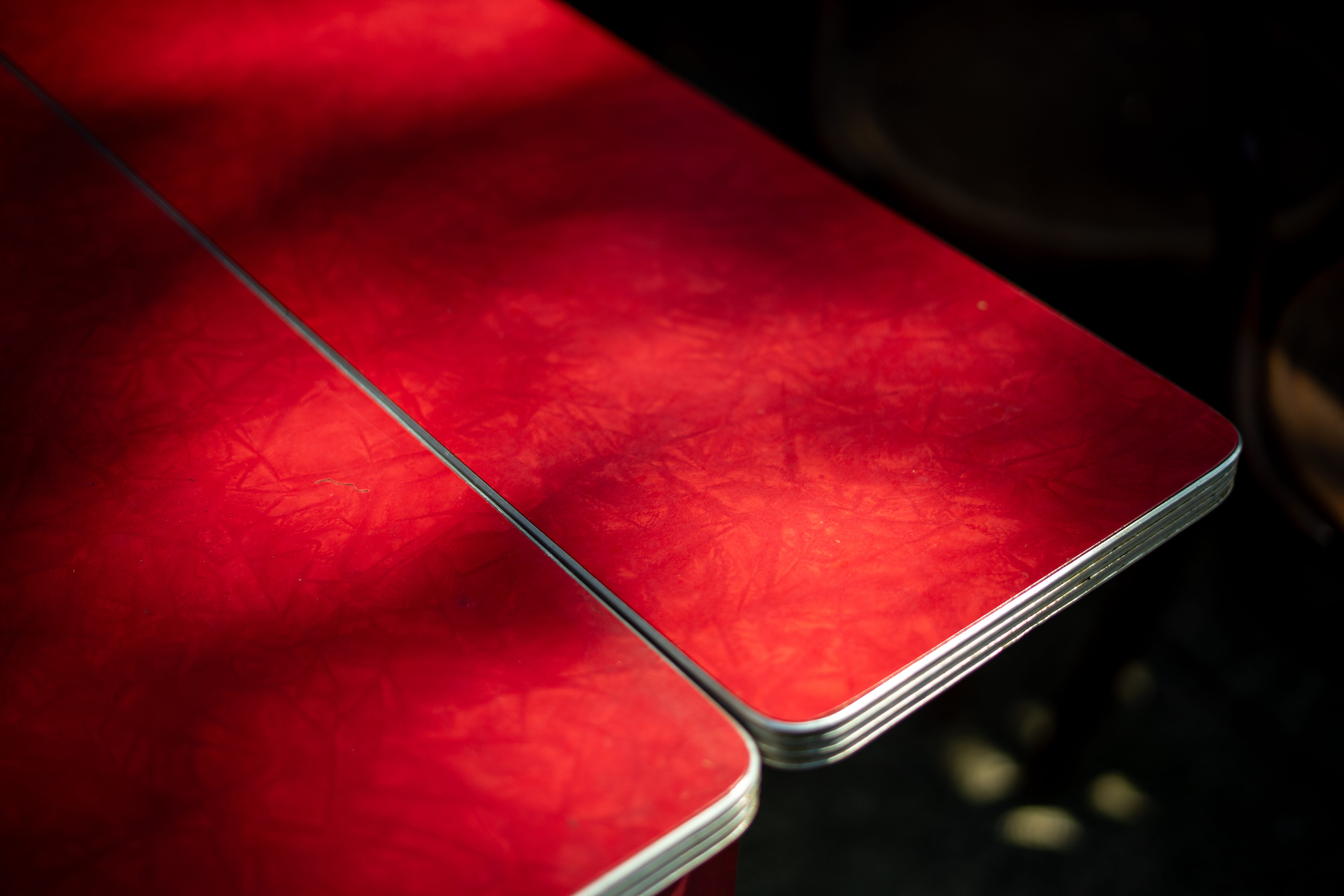
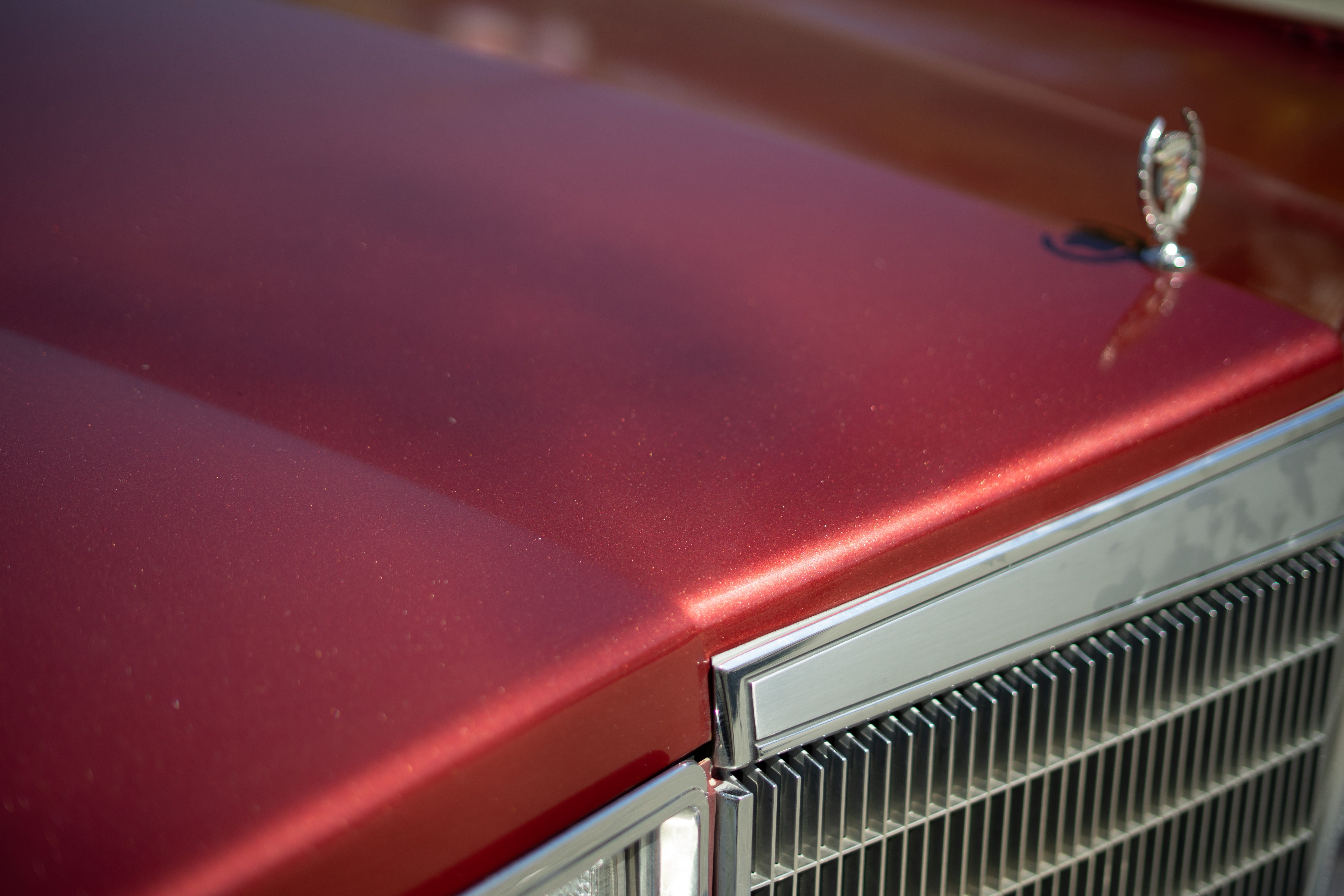
Whether it was a beloved jacket, an old t-shirt, a knit vest, or a new pair of socks, RED dominated this season in a big way.
I would simply ask, “Why red?” Some people smirked and had a theory to share; others looked down and didn’t even realize they were wearing red. It fascinated me that most people didn’t see this was happening around the neighborhood until we’d look around while standing and chatting, and another person would walk by wearing the colour in question.
The theories and claims for why red was so big this season ranged far and wide:
Claims of red being their favorite color since… forever?
A way to add a “genderless” pop of color?
Subtle Canadian party alignment during a tumultuous political moment? (Or taking back red from the MAGA crowd?)
Being subliminally directed by TikTok influencers?
Red Dress Day (MMIW) in May?
Liverpool and Arsenal battling for the top of the Premier League table?
It is simply a colour full of energy and vibrance
Maybe it gives “main character energy”!?
After four months of spring shooting, I ended up with six times the number of red photos compared to orange. I had more photos in general, but the proportion of red is impressive.
Another interesting theory was the rise of the “unexpected red theory” which was popularized for interior design heads on TikTok last year, unfortunately, this may have more of an impact than any of us would know, but I couldn’t tell you first hand, I stay away from that app.
My favorite explanation, after months of asking, was that red represented rebirth. New life after a dark and drab winter filled with shitty weather and even shittier politics. Red represented hope for something new. And maybe, underneath all the other explanations that’s really what everyone was feeling.
I guess we’ll never really know, but here we are, with another set of incredible photos of people organically and subconsciously joining a community collective in portraying an energy and style in the neighborhood.
Another display of 12 seasonal photos will be up at Alterior for a month or so, this season it was much harder to produce as I had way more photos to pick from.
To compliment the board and have an outlet for more of the photos, I produced a zine, as an ode to how I used to produce this magazines as well as a tribute to Bill.
This seasonal zine has been quite an interesting process. I’ve hand-made many zines in the past, but for some reason, every single step of this one has presented itself with some sort of challenge or hiccup. I ordered them to be printed weeks ago, and the shipping got endlessly delayed, forcing me to cancel the order and find an alternate way of printing them. The printer I ended up using was broken for three days as I tried to troubleshoot a bent corner issue that was causing the machine to back up. Meanwhile, I had this idea to paint these little water colour car hoods to include with the first 13 copies. I had gotten a handful done, and for some reason, hid them somewhere and I can’t find them, so I had to paint a bunch more. The covers came out very pixelated the first time I printed them. The stapler would not penetrate the pages, and my glue was clogged. But, here we are and if you’d like to add one to your collection, they will be available, starting Sunday (June 22nd), at Alterior/A Living Taste.
Thanks for reading.
If you are enjoying my work, I would kindly ask that you take the time to like, comment, or share this post with a friend.
I am really enjoying making these projects and sharing my progress, and I hope you can help spread these stories far and wide.