


INS(oev)IDE #13 - 2024 Book Making Process
Some insights into how I go about choosing and organizing the photos I include in my yearly book, some of the things I learned this year, and some patterns and trends I saw in my photos

A Brief History
Since 2017, I have been producing some version of a “best of” collection for this project. For the first four years, I was printing “zines” at work on weekends as I was stuck around the school during my coaching duties in the rainy basketball season.
I wanted these zines to be free. I was still early in the process and I wasn’t very confident in anyone wanting to grab copies to begin with.
I also had some short forays early on, creating “products” associated with my “brand” as I am sure every early Instagram project who starts to see the followers tick up tries to do. They were met with little to no enthusiasm, friends and family of course supported, but I ended up giving away a few hundred dollars worth of merchandise over the first few years. I was not prepared to make that same mistake getting 100s of copies of books printed, only for them to collect dust in my closet.
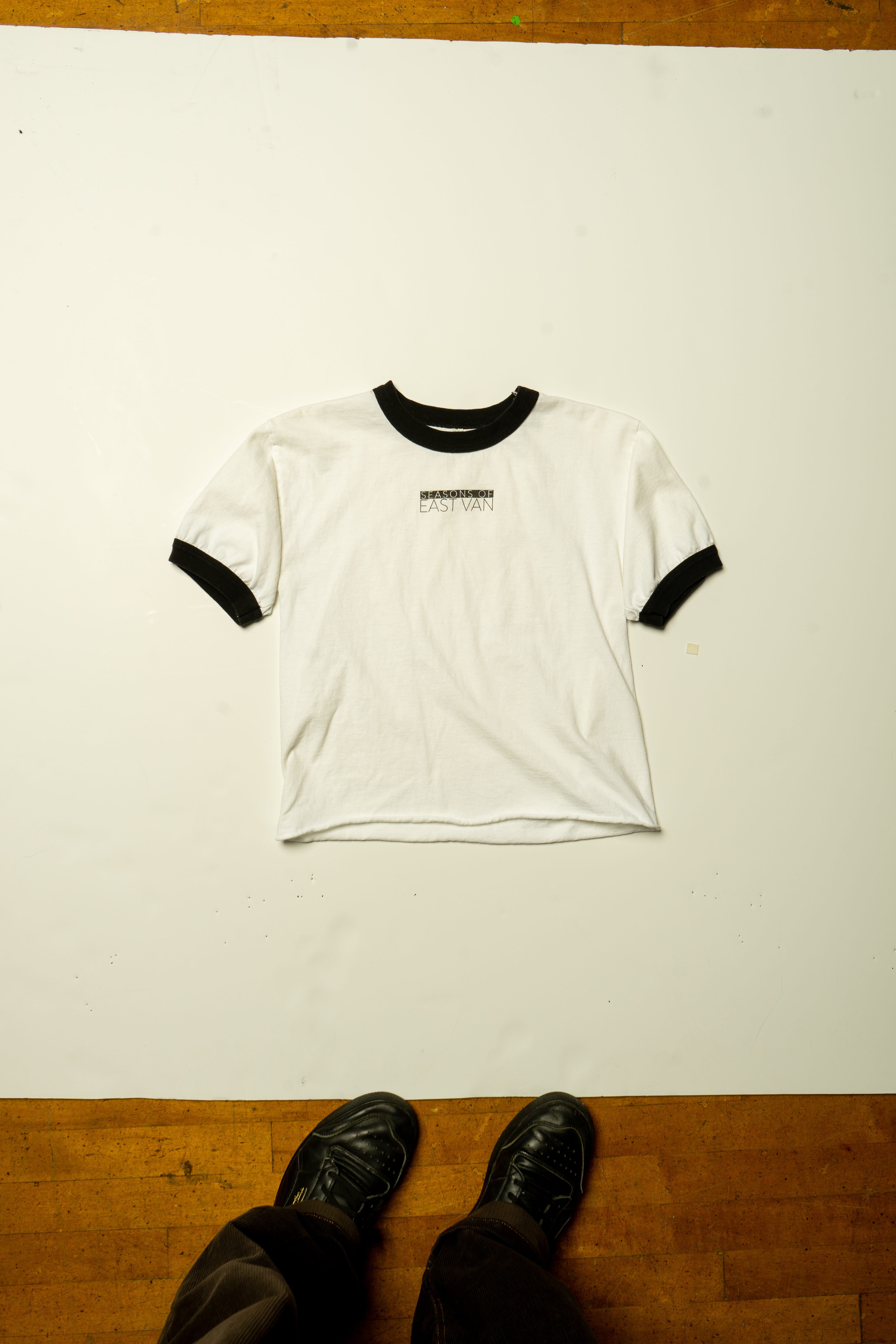
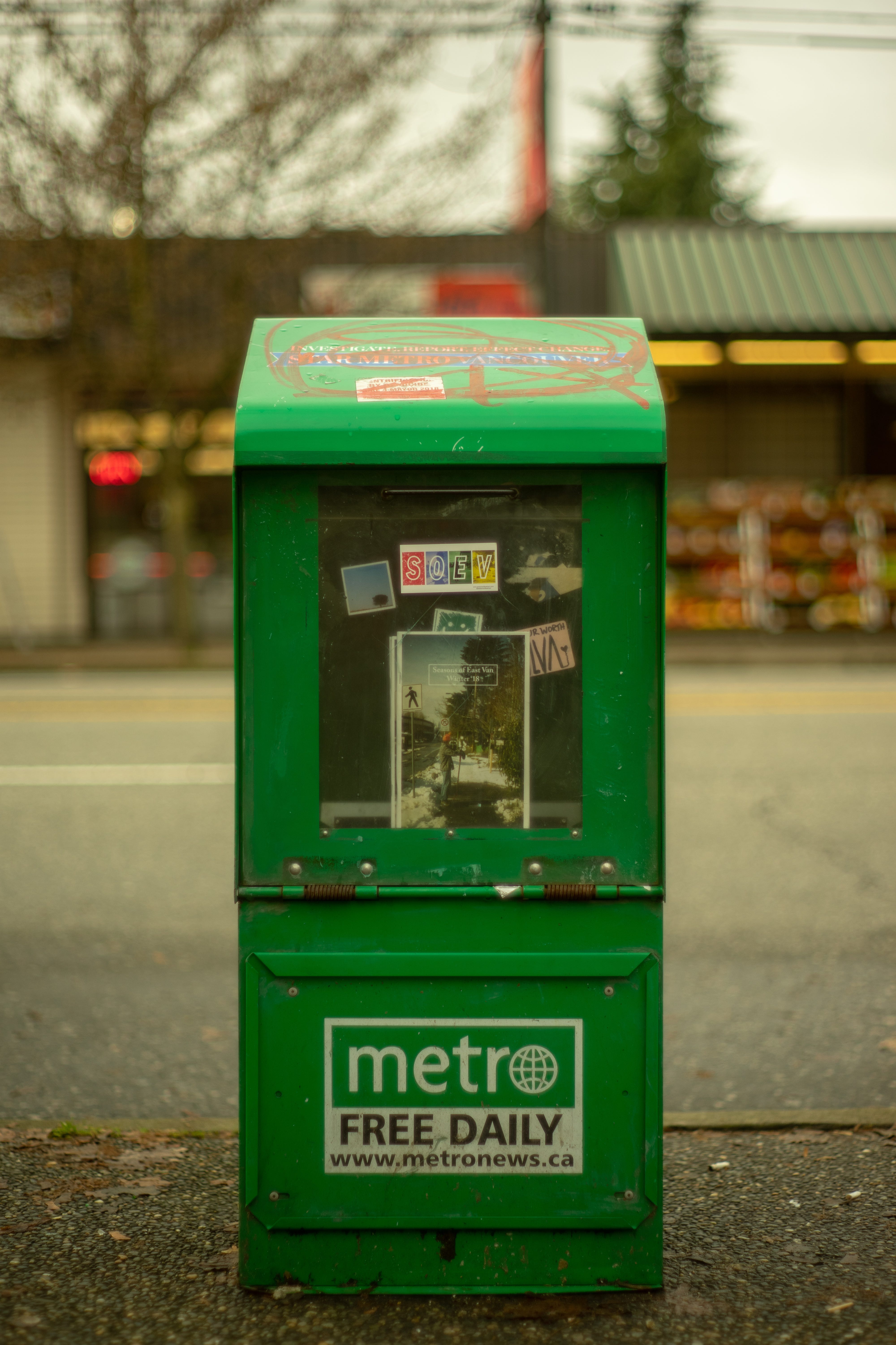
The first set of zines I ended up printing and stapling together myself, they were scooped up pretty quick. I’d take one lap down Commercial, hide a few and post them on my story, and by the time I got back to the spot about half an hour later, the copies would be gone. 100 free copies disappeared rapidly, people shared their finds on the streets, and requests in my DMs for more copies were frequent even weeks after they had all been claimed. These original copies were divided into each season, about 20-30 photos in each one.
I kept this up for a few years, but as my audience grew, the demand grew, and the number of photos I started to take also rapidly increased. It started to become labor intensive to print large runs of these zines as each season started to explode into a 75-100 page zine, staples barely being able to hold them together. I was unsure how much longer I’d be able to print them for free, nor if I even wanted to, so I started to shop around for “professional” production of the zine, and evolve this into more of a full on book or magazine. This also forced me to refine the images I decided to include in the book, since I could not be producing a 400 page magazine for the price range I thought people would purchase it at.
In 2022, I took the plunge into paying a professional printer and making a “real” magazine. I worked with a local printer, and after a few printing errors and hiccups, I was able to get my books online and in local stores just before the winter holidays, selling 150 copies in a couple of months, with people still looking for copies occasionally today (one or two might still be in stock at Slice of Life… and online at Alterior). I felt it was quite a success, I sold the first 100 within a couple days of releasing them on my website, and then the last 50 quickly got scooped up by retailers who wanted to have them in stock, something I didn’t even consider the first time around!
During this time, I was also able to sell them directly to my audience with a bit of a margin, and was able to donate funds directly to local organizations which I have been consistently supporting through this project. I aim to do the same this year.
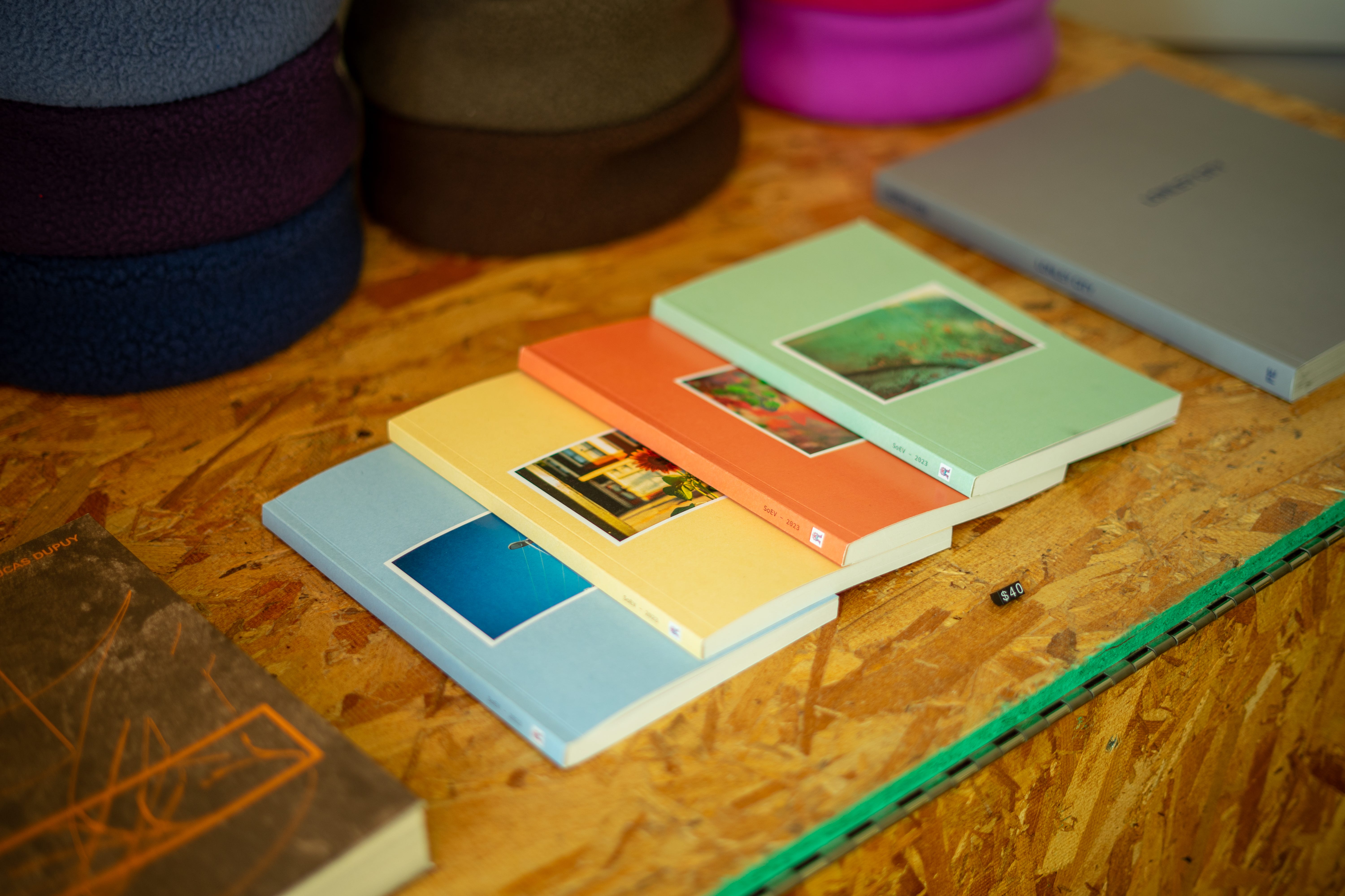
Last year (2023), I decided to go down the same path. On a high from the year before, I had my retailers set, and my online store already set-up. I posted a few “preview” Instagram stories and a poll with many (85% of 500 voters) clicking that they would be interested in purchasing a copy, I decided to go with 200 copies, with four different covers available. Again I had anticipated them being ready before the winter holidays, but the printer was tough to get a hold of a lot of the time, and the printing got delayed waiting for paper until late January.
Once I did have them ready to go, it turned out, the enthusiasm wasn’t as high as I had anticipated or as was indicated on Instagram. It was likely a combination of a slow retail year in general, with tightened budgets, a lack-luster advertising campaign on my end, as well as maybe leaning too deep into the “results” from an Instagram poll (apparently clicking “I’ll buy” is not a commitment to buy…). A year later, retailers still have copies (not a bad thing, but not great), and I still have a few copies stored as well. I estimate I sold about 150 copies, which is great, but less than I thought.
Which leads me now to this years book…
Changes for 2024
This was my first full year living in the suburbs, away from “east van”. I had lived there for 8 years prior and having easy access (and no child) meant I was able to frequent the streets to take photos at least twice a week, sometimes up to 5 or 6 times in the summer, so I always knew I’d have an abundance of photos to base a book/zine off of.
After I had a tougher time selling books last year and being unsure how many photos I’d be able to get this year, in the back of my mind, I was unsure if I’d be able to even produce a book for 2024.
Luckily, as the year progressed, I was able to make it into the city and collect more than enough photos to make a book (evidently).
When autumn crept back around, I started to look back on each season, deciding if I had enough quality to grant another book making process.
As I had mentioned in previous writings, this summer might be one of the best collections of photos I have taken to date, and looking back on them made me super excited to start this process again. So I committed to producing another book.
This year, I am going to start with a much smaller run. I am going back to a limited run of 100 copies. As a reader, you will actually get first crack at the 2024 book, at a discounted price. More information below; the code expires on Tuesday at 11:59pm!
I decided to also change the form factor. This year, the books will be quite a bit bigger, both in page count and size. Inspired by Fruits Magazine I decided to go with 17cm x 24.5cm.
I ordered them through Mixam this year (more information below) and I am really satisfied with the way they turned out!
I will still be making a donation this year, but rather than waiting to see how they sell, I will make the same donation I did last year to the Downtown Eastside Womens Center. This time of year is always tough and any additional funds go a long way for that organization, I am now financially in a position that doing a run of 100 books won’t break the bank, even if none sell, so forwarding funds over to the places in our community that need it is more important to me than trying to justify a “donation per book” price. If you are in a position where you can donate, please consider clicking the link above.
Over the years, I have had quite a few people reach out and ask how I go about organizing and choosing photos for my magazines. If you’d like to learn more about the book making process, please keep reading, if you’d like to skip down to buy a book, click here.
Creating the Book
Sorting Photos
The process happens in three main steps, which I will outline below with some graphics to help the visualization process that I go through while sorting and deciding.
File Organization
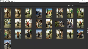
As I edit and process my photos, I always organize by season (obviously) and date. Once a season comes to a close, I usually go back and pick a “best of", by looking at all the photos together from the season simply by scrolling through them in chronological order in Windows by opening the parent folder and searching “*”.
I do this process pretty fast. The photos I pick are typically ones that pop out to me right away in the smaller format that I see during this “whole folder search” on Windows. There are definitely photos I recognize right away as they were a trend that I’ve been seeing, a really fun interaction I had, a local I’ve highlighted a bunch of times, or a photo that has beautiful composition or colour. This is usually the third or fourth time I’ve looked through the photos as a set by this point as I’ve already edited, sorted, and then re-edited and sorted for Instagram.
From there I send that completed season to my external hard drive and delete the folder from my local hard drive until the book making process starts a few months later.
Photos to Pages
As I get closer to the production date, I start to go back to the “best of” folders from each season and sort/consolidate the photos either by colours or common styles.
I used to do this by putting them all on my desktop to mimic having them printed laying out on the table in front of me to then sort them into groupings of photos that share some commonality. This process was a bit messy, as I would then have to slowly rename and move each of the photos back into a different folder to keep the order/organization I had created within these piles.
This year, I found out that Adobe Bridge can be used to do this sorting AND it has a bulk rename feature, which made it so much easier to rename the files in the order that I wanted to see them on the pages.
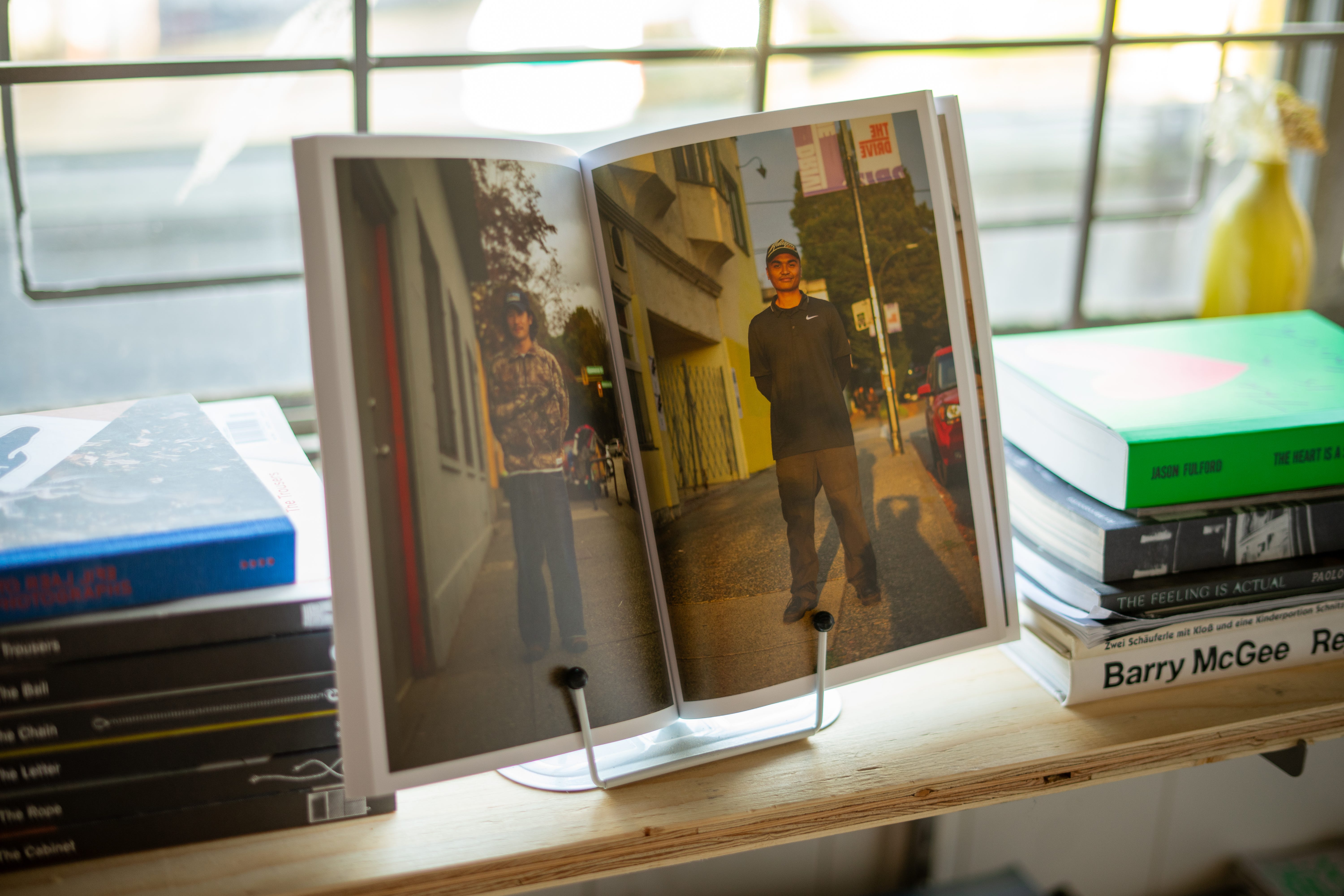
I also played with the idea of having multiple photos on one page, but as I started to look through the photos again, I couldn’t bring myself to not highlight each photo individually, especially in this larger format.
Once I have some preliminary grouping done based on colour or style trends, I start to pair the photos.
Knowing that they are going to be two portraits facing one another in the book, I put them in pairs that complement the two photos together. Sometimes it’s based on the initial groupings, such as colour, compositional complements, or style trends, but other times it becomes a bit more ambiguous to the viewer as I have often paired friends or experiences, as a little “easter egg” for myself and the people who are involved.
I find this process is really fun and it doesn’t take me too long. I am sure I could spend hours going over different combinations and organizing them in multiple ways, but I really try to go on instinct with these pairings, trying not to over think them, and knowing that I will have one more chance to change the pairings once I import them into the InDesign file where I will see them “on the page” together.
Adobe InDesign & Printing
Once the photos are paired and renamed, it is time to set up the Adobe InDesign file.
There are many tutorials out there for this process, and setting up a document often depends on the specifications of the printer you are using, so I won’t go into too much detail about how this process happens, but I will give some quick insight into how I speed up this process, and how I picked a printer this year.
In InDesign, I set up my document with the correct bleeds and size, without a cover, and then start making parent pages that have the frame size that I want to appear on all pages. From there, it is just a matter of drag and dropping the images from my organized folder into the pages.
At this step, I occasionally find a pairing that I would like to change, but it becomes pretty automatic, putting 4-6 images into InDesign at a time. I check it over, create a cover and back page and save it to a single page PDF (as requested by the printer).
This year I had to go with an online printing provider, rather than dealing with the local printer I used in the past. I try my best to keep all my purchasing local, whether it be clothing, food, or in this case, retail products, but unfortunately, the local printer I worked with in the past a) made quite a few mistakes on the last two runs, b) their communication was quite poor (likely because of how small my run is, probably didn’t get much priority), and c) their prices for this format would have made my retail price of these books over $80 each.
I decided to use Mixam, as their prices were good, they use paper similar to the paper I used prior, and they were able to ship quickly, the total turn around time from uploading the PDF to at my door was under two weeks, even with the current Canada Post strike. Another nice feature was, as you build the quote on their website, a PDF is created with the exact specifications you should make your layout for editing your document, which I really liked. They turned out awesome and I would definitely use them again next year at this point.
Cover Design
One of the biggest hurdles of making these books for the past two years was designing a cover. I found the idea of deciding on what I want the “face” of this magazine to be quite overwhelming; having to consider a design I liked, that I could create, that would be appealing on shelf, and that would spark curiosity for someone to pick it up off a shelf, was a lot to consider for someone who does not specialize in design.
For the first cover, I used Anastasia’s logo she created for me in four different colours representing the seasons which she graciously made for me. Some feedback from retailers that year though, was that people didn’t gravitate to picking it up to check it out if they weren’t already familiar with the project.
For the second year, for some reason, I thought it would be a cool idea to do four covers, each with their own seasonal flavor and photo. My thinking was, at least if I put an image on the front, people will know its a photography book? I was also in the mindset that people would want to race to pick their favorite and lock in a purchase to ensure they got that one. Turned out it kind of worked against me, with the yellow summer cover selling out online right away, but then I was subsequently left with an abundant amount of red covers…
This year, I decided to reach out to my IG audience to see if anyone would be willing to design me a cover. I had an overwhelming response and took a week or so to look through a bunch of the portfolios I was sent.
It was so hard for me to choose but I decided to go with a designer (Raina Bhatia) that had a really intriguing design that stood out to me every time I would go back through the portfolios. We had an online meeting and went back and forth with some iterations of designs.
I had some basic idea of what organization I wanted, things I didn’t want, but I had no idea really where to get started. I knew I wanted a dual cover design, bridging the lesson I learned last year with four covers, into this cover that could be both different and the same at the same time. I knew I wanted it to be read in both directions, depending on what season you wanted to start at.
Here is the final design, with a few more key elements explained and highlighted, some were intentional design pieces, others came together a bit like magic.
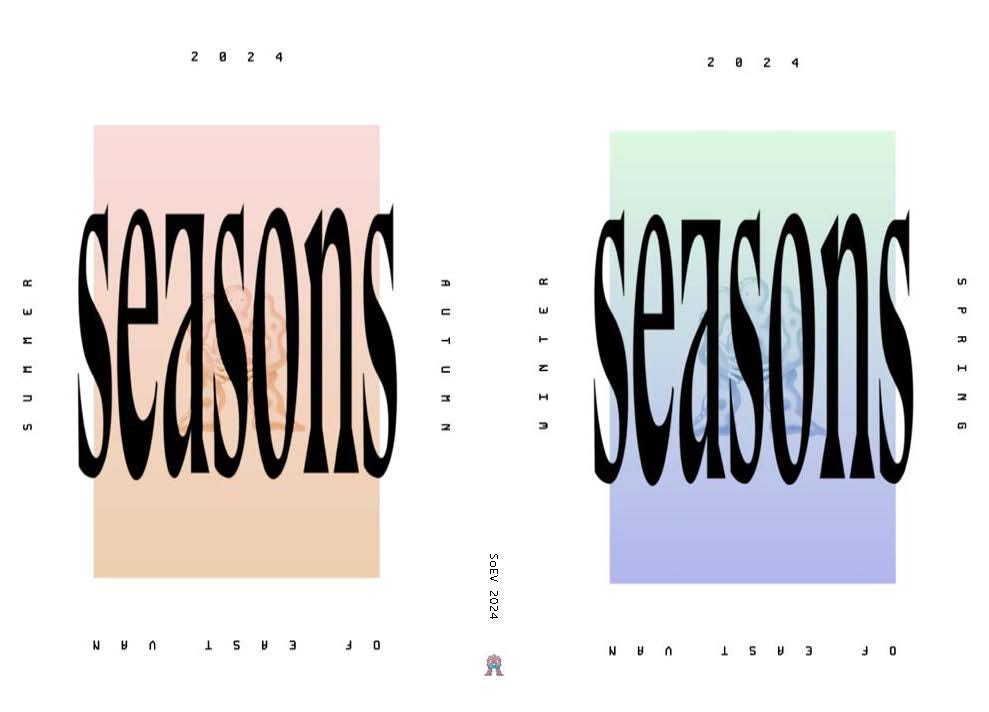
The fading color gradient mimics what happens on my website in the middle of every season, one season fades into the next.
The large “seasons” was one of the original fonts, designed by Raina. One of her original designs had the seasons (WSSF) upside down above and below the main image in the middle. I liked the aesthetics of it, but something wasn’t right to me looking at the different season name upside down.
Instead, I asked her to put the year at the top, seasons on the side, and “of east van” upside down on the bottom, an ode to the “Native Hosts” signs on the UBC signs I’ve always loved on their campus.
Adding Anastasias illustration in the back initially satisfied a request that I made seeing that it needed another element when she first sent the designs that had the fading colours. Then I realized how it was a perfect way to keep the evolution of the book all on the cover, given that now all three covers share similarities.
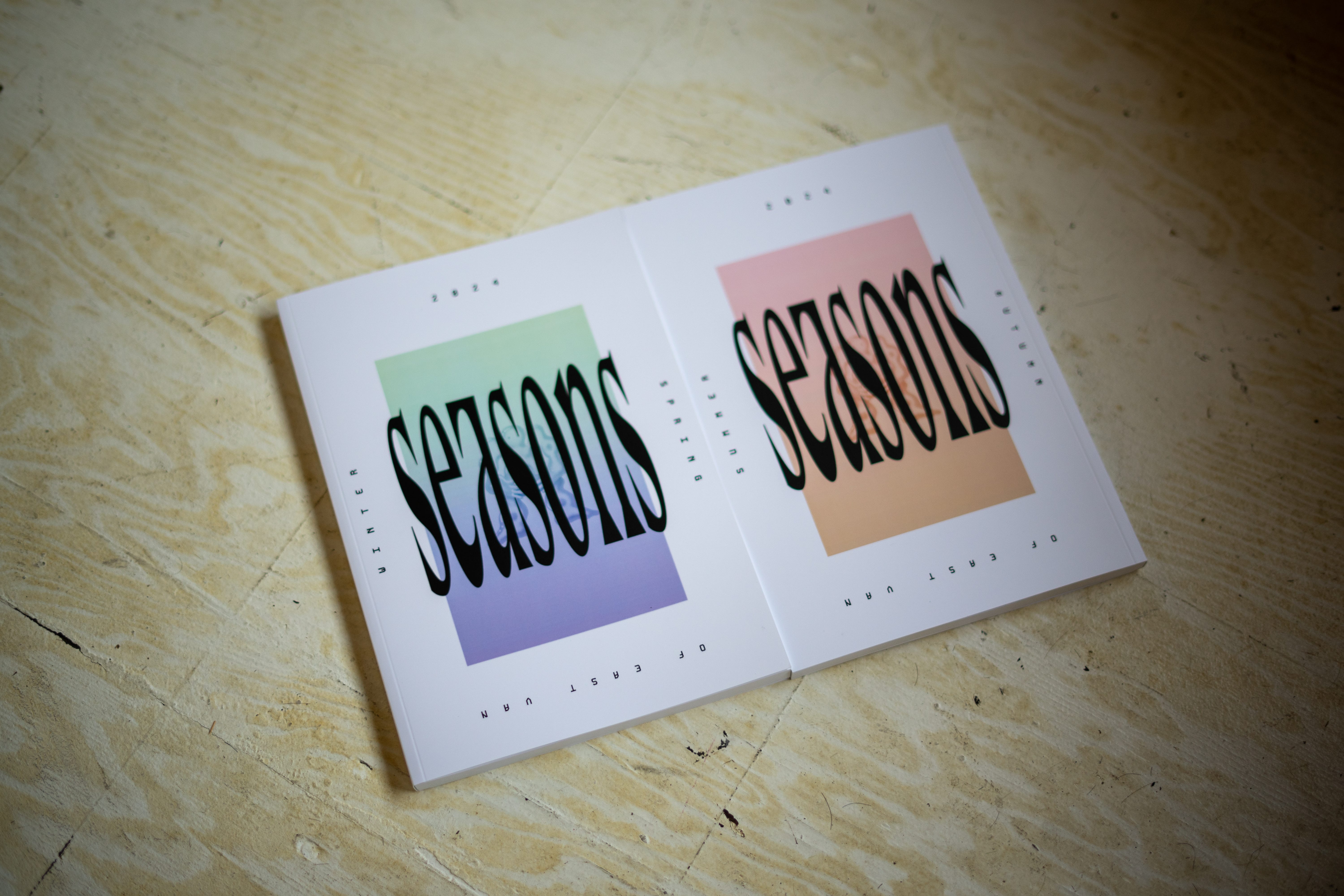
Final Product
The final product is here and I am really satisfied with it, because I appreciate you being a reader, I am offering my Substack subscribers first crack at ordering, AND at a discounted price. Here is the website.
The discount code is SEASONSCHANGE and will expire first thing Wednesday morning.
The first batch of shipments will be sent out on Sunday Dec 8th, with another batch the following week, until I leave for my holiday travels. After that, shipments will begin again during the first week of January.
If you are a local, Alterior has been kind enough to offer free pick-up in their new store, that option is available at check-out.
Thanks for going into detail about the process; every step you describe exudes what I know about your character so much! Also, for anyone wondering if they should buy a book, not only are they great to have on your own shelf, these books make fantastic Christmas gifts!
Hi Mike, I can't seem to check out when I select "pick up in store'. the problem seems to be is that there are no store locations listed. I can check the radio button, but then get a message "There are no pickup locations available."